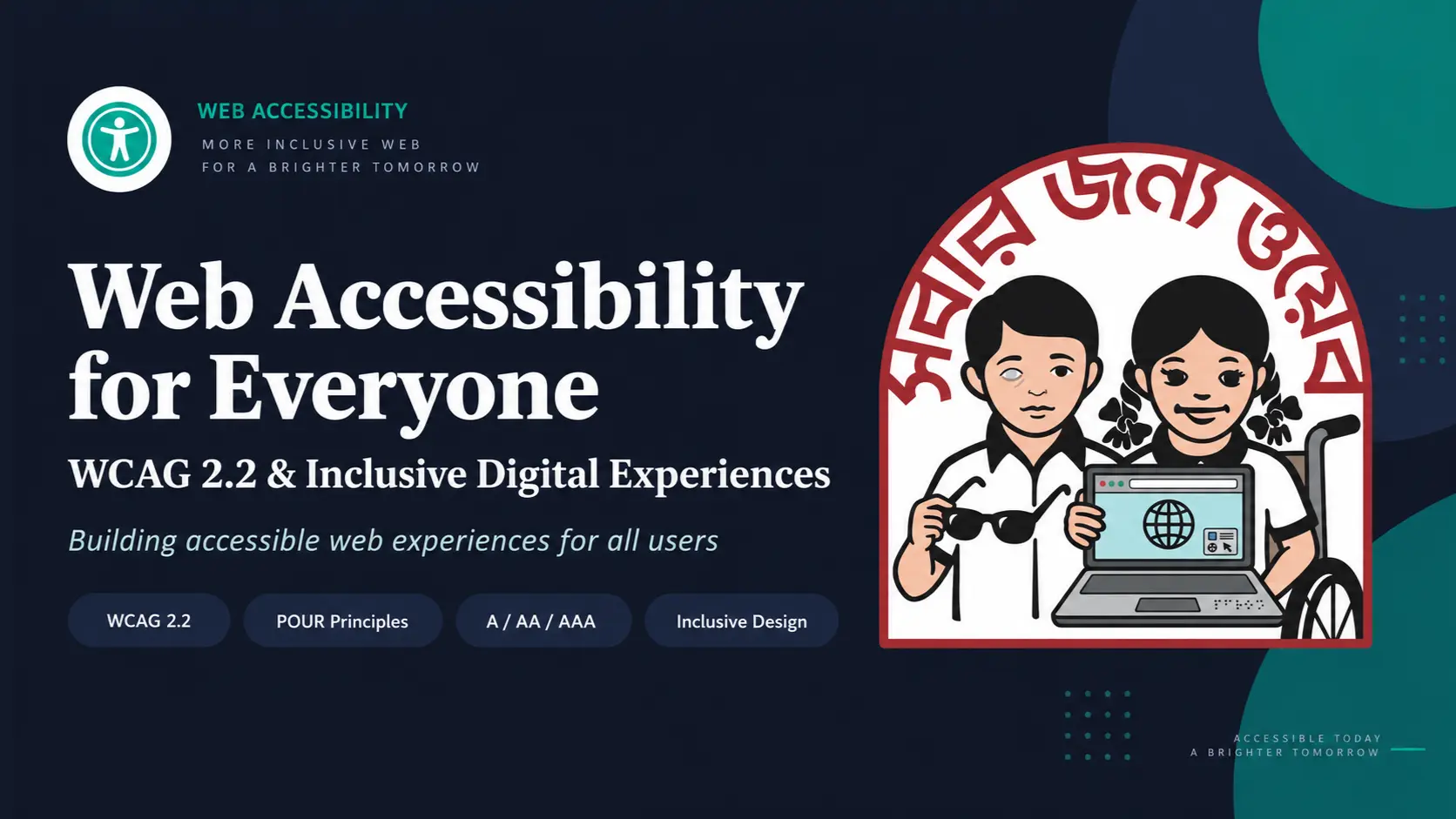
Try this for one minute. Close your eyes. Now open your phone and try to buy something from your favorite shopping app, using only your fingers and your memory of where the buttons are. Hard, right? Maybe impossible.
Now think about this. Millions of people do exactly this every day. Not for one minute, but for their whole life. Not because they are trying an experiment, but because it is the only way they can use a computer.
That is what web accessibility is about. And most of us, as developers, never think about it until something forces us to. I did not either for a long time. Then I unplugged my mouse and tried to use a site I had built myself. I could not finish checkout. That was a bad day, but a useful one.
Why This Actually Matters
The World Health Organization says over 1.3 billion people live with some kind of disability. That is about 1 in every 6 people on earth. That is not a small edge case. That is a huge part of your users.
- People who cannot use a mouse and only use a keyboard
- People with low vision who zoom their screen to 200% or more
- People who are Deaf or hard of hearing and need captions
- People with shaky hands who cannot hit a tiny button
- People with a broken arm this month or eye surgery last week
- People standing in bright sunlight trying to read gray text
- People holding a baby in one hand and tapping with the other
Some of these situations are permanent. Some are temporary. Some happen to literally everyone at some point. Accessibility is not a small feature for a small group. It is just making your website work properly, for more people, more of the time.
There is also a boring but real reason to care: money and risk. Lawsuits over inaccessible websites are common in the US. Government and big company contracts now ask for accessibility proof before they sign anything. In Europe, the European Accessibility Act pushes the same thing.
A site that fails accessibility usually fails normal usability too. Bad contrast, confusing forms, and buttons nobody can find hurt everyone. Fixing accessibility fixes those things for everyone, not just for users with disabilities.
Three Myths, Killed Quickly
- It is only for blind people. No. Keyboard users, Deaf users, users with shaky hands, and users with reading difficulty are all part of this too.
- It is expensive. It is expensive if you bolt it on at the end. If you do it while building, most of it costs nothing. Using a button instead of a div takes the same amount of typing.
- It makes design ugly. Good contrast, clear focus, readable text, and big enough buttons are just good design.
So What Is WCAG, Really?
WCAG stands for Web Content Accessibility Guidelines. It is written by the W3C, the same organization behind HTML and CSS. It answers one question: how do we know if a website is accessible or not?
The current version is WCAG 2.2, released in 2023. It is not a vague list of nice ideas. It is a set of specific rules called success criteria. You either pass one or you fail it. There is no kind of accessible.
Every rule sits under one of four principles, remembered with the word POUR: Perceivable, Operable, Understandable, and Robust.
| Principle | Question it answers |
|---|---|
| Perceivable | Can people sense the content, see it, hear it, or get an alternative? |
| Operable | Can people use it with any input method? |
| Understandable | Does it make sense? |
| Robust | Will it keep working across browsers and assistive technology? |
Every rule also has a level. Level A is the bare minimum. Level AA is what almost every law and serious company targets. Level AAA is the strictest level and is rarely required for an entire site. If someone tells you that a site is WCAG compliant, ask which version and which level.
The Rules That Actually Change Your Code
WCAG 2.2 has 87 success criteria. Nobody memorizes all of them and you do not need to. A handful fix most of the real pain.
For People Who Cannot See the Screen Well
1.1.1 Non-text Content, Level A: every image needs a text alternative. A screen reader cannot see a picture. No alt text means the user hears image and nothing else. If the picture carries information, describe it. If it is decorative, hide it with an empty alt. Write what the image means, not what it is.
1.3.1 Info and Relationships, Level A: structure must be in the code, not just in the CSS. If something looks like a heading, it must actually be a heading. Use real elements for headings, lists, tables, and form labels.
1.4.3 Contrast Minimum, Level AA: aim for at least a 4.5:1 contrast ratio for normal text. Low contrast is one of the most common accessibility bugs on the internet, and it also makes reading difficult outside on a sunny day.
1.4.1 Use of Color, Level A: color alone is never enough. If your only error signal is a red border, some users see nothing. Add a label, icon, or text message as well.
1.4.4 Resize Text and 1.4.10 Reflow, Level AA: your layout must survive zooming. Someone with low vision may zoom to 200% or more. Avoid fixed heights and overflow hidden when content needs to grow, and never use maximum-scale=1 in your viewport meta tag.
For People Who Do Not Use a Mouse
2.1.1 Keyboard, Level A: everything must work with a keyboard. Use real button, a, and input elements. You get keyboard support for free.
2.4.7 Focus Visible, Level AA: never delete the focus ring. If you remove the default outline, replace it with a visible focus style that matches your brand.
2.4.3 Focus Order, Level A: the tab order must make sense. Visual order and DOM order should match, and positive tabindex values usually make things worse.
2.4.1 Bypass Blocks, Level A: give people a skip link so keyboard users do not have to tab through an entire navigation on every page.
2.4.11 Focus Not Obscured, Level AA and new in WCAG 2.2: sticky headers, cookie banners, and chat widgets should not cover the element a user has just focused.
For People Who Cannot Hear
1.2.2 Captions, Level A: every prerecorded video needs captions. Captions help Deaf users and everyone watching muted on a bus. Auto-generated captions are a starting point, not a finish line.
For People With Limited Hand Movement
2.5.8 Target Size, Level AA and new in WCAG 2.2: make buttons big enough to hit. The rule asks for at least a 24 by 24 pixel tappable area.
2.5.7 Dragging Movements, Level AA and new in WCAG 2.2: always offer a no-drag path. Add up and down buttons to reorderable content, or use a native range input that works with arrow keys.
2.2.1 Timing Adjustable, Level A: let people turn off or extend time limits. Everything takes longer with a screen reader or switch device. Warn users first and let them ask for more time.
For People Who Set Preferences on Their Device
Respect reduced motion. Big parallax and scroll effects can cause nausea and dizziness for people with vestibular problems. Their operating system already tells you when they need less motion, so listen to it. Also respect prefers-color-scheme and prefers-contrast where appropriate.
How Do You Test All This?
You need two layers of testing. Automated tools catch about 30 to 40 percent of issues, such as missing alt attributes, bad contrast, empty buttons, and broken ARIA. Run axe DevTools or Lighthouse, add eslint-plugin-jsx-a11y where appropriate, and put Pa11y or Axe CLI in CI so nobody re-breaks it next sprint.
Manual testing catches the other 60 to 70 percent because a robot cannot judge meaning. Is the alt text actually useful? Does the tab order make sense? Can someone complete checkout?
- Unplug your mouse and finish one full user flow with only Tab, Shift+Tab, Enter, Space, and arrow keys.
- Zoom to 200%, then 400%, and look for clipped or overlapping text.
- Turn on a screen reader. NVDA is free on Windows, and VoiceOver is built into Mac.
- Check contrast on every state, including hover, focus, and disabled states.
And What About a Whole Website?
WCAG gives you the rules, but a real site has hundreds of pages. Nobody tests every page against all 87 rules by hand. That is where WCAG-EM comes in. Think of WCAG as the rulebook and WCAG-EM as the inspection process.
- Define the scope: which site, conformance level, browsers, and technologies.
- Explore the site and understand what it does and how it is built.
- Pick a representative sample, including key flows and each different page template.
- Test the sample against every rule in scope.
- Report the findings with each failure mapped to a specific success criterion and evidence.
Where To Actually Start
You do not have to fix 87 rules by tomorrow. Start with the boring basics: real HTML elements instead of styled divs, alt text on images, visible focus states, decent contrast, and labels on form fields. That alone removes most of the daily pain for real users.
Then make accessibility part of how your team works. Add an accessibility line to your Definition of Done, run a scanner in CI, and do one keyboard-only pass before each release. Accessibility is not a checklist you finish once and forget. It is closer to writing tests or clean code. It is part of doing the job properly.
Explore the WCAG 2.2 Training Suite
The Takeaway: Once you start noticing accessibility, you cannot un-notice it. You will catch yourself unplugging your mouse on a random Tuesday just to see if your own site still works. It probably will not the first time. Fix it anyway. Your users may never write you a thank-you email for it, but they will be able to use what you built. That is enough.